Cocos Creator 内置了一些常用的组件,在游戏使用的时候很方便,如果我们想要拓展一下组件,就需要简单的了解一下如何拓展,官方文档给的说明有限 扩展 Inspector,使得很多时候无从下手,下面简单的记录一下如何拓展组件,做一个多选组件。
首先代码这里用 官方的单选按钮(cc.Toggle)和单选按钮组(ToggleContainer) 做基本参考,然后拓展组件。
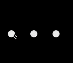
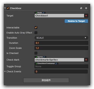
先看一下 最终效果:
先说一下环境:
- Cocos Creator 2.3.4 (我这里用最新版2.4.6已经查看不到 Inspector)
步骤
创建项目
- 新建一个项目,然后新建一个系统组件,这里新建一个cc.Toggle

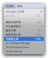
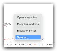
- 选中我们的组件,然后选择Cocos Creator 的菜单 【开发者】—> 【开发者工具】
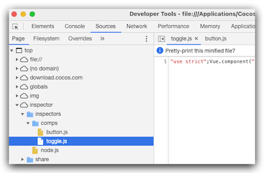
- 然后查看【Sources】–>【inspector】–>【inspectors】–>【comps】–【toggle.js】
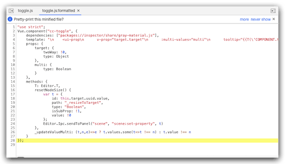
- 然后选择代码 我们简单的格式化一下
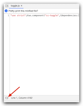
- 格式化后变成这样
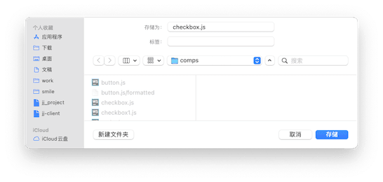
保存文件到我们的自定义目录 ,这个目录是我们自定义插件的目录,自己先新建一个插件:custom-component,然后在目录下新建文件夹 inspectors/comps
然后把上面 第5步 的文件保存在这个目录下 名字修改为 checkbox
重新美化代码
其实上面的代码已经可以继承,但是我们还是要格式化美化一下代码,这里为选择Webstorm,首先我新建了一个test.html
然后,我把template 后面的字符串复制 然后粘贴一下,此时,编辑器帮着自动的美化了,重新拷贝回去即可。
1
2
3
4
5
6
7
8
9
10
11
12
13
14
15
16
17
18
19
20
21
22
23
24
25
26
27
28
29
30
31
32
33
34
35
36
37
38
39
40
41
42
43
44
45
46
47
48
49
50
51
52
53
54
55
56
57
58
59
60
61
62
63
64
65
66
67
68
69
70
71
72
73
74
75
76
77
78
79
80
81
82
83
84
85
86
87
88
89
90
91
92
93
94
95
96
97
98
99
100
101
102
103
104
105
106
107
108
109
110
111
112
113
114
115
116
117
118
119
120
121
122
123
124
125
126
127
128
129
130
131
132
133
134
135
136;
Vue.component("cc-toggle", {
dependencies: ["packages://inspector/share/gray-material.js"],
template: `<ui-prop
v-prop="target.target"
:multi-values="multi"
tooltip="{{T('COMPONENT.toggle.target')}}"
></ui-prop>
<div class="horizontal layout end-justified" style="padding:5px 0;margin-bottom:5px;">
<ui-button class="blue tiny"
v-disabled="multi"
@confirm="resetNodeSize"
:multi-values="multi"
>
Resize to Target
</ui-button>
</div>
<ui-prop
v-prop="target.interactable"
:multi-values="multi"
tooltip="{{T('COMPONENT.toggle.interactable')}}"
></ui-prop>
<ui-prop
v-prop="target.enableAutoGrayEffect"
tooltip="{{T('COMPONENT.toggle.auto_gray_effect')}}"
:multi-values="multi"
></ui-prop>
<cc-gray-section
v-if="target.enableAutoGrayEffect.value"
:target.sync="target"
:multi-values="multi"
></cc-gray-section>
<ui-prop
v-prop="target.transition"
tooltip="{{T('COMPONENT.toggle.transition')}}"
:multi-values="multi"
></ui-prop>
<div
v-if="!_updateValueMulti(target.transition, 1, multi)"
>
<ui-prop indent=1
v-prop="target.normalColor"
:multi-values="multi"
tooltip="{{T('COMPONENT.toggle.normal_color')}}"></ui-prop>
<ui-prop indent=1
v-prop="target.pressedColor"
:multi-values="multi"
tooltip="{{T('COMPONENT.toggle.pressed_color')}}"
></ui-prop>
<ui-prop indent=1
v-prop="target.hoverColor"
:multi-values="multi"
tooltip="{{T('COMPONENT.toggle.hover_color')}}"
></ui-prop>
<ui-prop indent=1
v-prop="target.disabledColor"
tooltip="{{T('COMPONENT.toggle.disabled_color')}}"
:multi-values="multi"
></ui-prop>
<ui-prop indent=1
v-prop="target.duration"
:multi-values="multi"
tooltip="{{T('COMPONENT.toggle.duration')}}"
></ui-prop>
</div>
<div
v-if="!_updateValueMulti(target.transition, 2, multi)"
>
<ui-prop indent=1
v-prop="target.normalSprite"
tooltip="{{T('COMPONENT.toggle.normal_sprite')}}"
:multi-values="multi"
></ui-prop>
<ui-prop indent=1
v-prop="target.pressedSprite"
tooltip="{{T('COMPONENT.toggle.pressed_sprite')}}"
:multi-values="multi"
></ui-prop>
<ui-prop indent=1
v-prop="target.hoverSprite"
tooltip="{{T('COMPONENT.toggle.hover_sprite')}}"
:multi-values="multi"
></ui-prop>
<ui-prop indent=1
v-prop="target.disabledSprite"
tooltip="{{T('COMPONENT.toggle.disabled_sprite')}}"
:multi-values="multi"
></ui-prop>
</div>
<div
v-if="!_updateValueMulti(target.transition, 3, multi)"
>
<ui-prop indent=1
v-prop="target.duration"
:multi-values="multi"
tooltip="{{T('COMPONENT.toggle.duration')}}"
></ui-prop>
<ui-prop indent=1
v-prop="target.zoomScale"
:multi-values="multi"
tooltip="{{T('COMPONENT.toggle.zoom_scale')}}"
></ui-prop>
</div>
<ui-prop
v-prop="target.isChecked"
tooltip="{{T('COMPONENT.toggle.isChecked')}}"
:multi-values="multi"
></ui-prop>
<ui-prop
v-prop="target.checkMark"
tooltip="{{T('COMPONENT.toggle.checkMark')}}"
></ui-prop>
<ui-prop
v-prop="target.toggleGroup"
tooltip="{{T('COMPONENT.toggle.toggleGroup')}}"
:multi-values="multi"
></ui-prop>
<cc-array-prop :target.sync="target.checkEvents"></cc-array-prop>
`,
props: {target: {twoWay: !0, type: Object}, multi: {type: Boolean}},
methods: {
T: Editor.T, resetNodeSize() {
var t = {id: this.target.uuid.value, path: "_resizeToTarget", type: "Boolean", isSubProp: !1, value: !0};
Editor.Ipc.sendToPanel("scene", "scene:set-property", t)
}, _updateValueMulti: (t, n, e) => e ? t.values.some(t => t !== n) : t.value !== n
}
});编写代码
Checkbox.ts
1 | import {CheckboxContainer} from "./CheckboxContainer"; |
CheckboxContainer.ts
1 | import {Checkbox} from "./Checkbox"; |
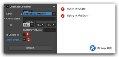
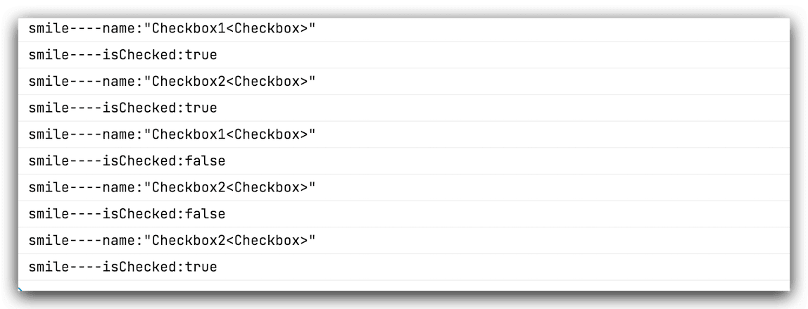
然后我们拖动一个单选按钮组,测试一下:
1 | private checkBoxHandler(checkbox:Checkbox){ |
输出结果:
总结
总的来说这个实现不难,拿Cocos Creator 3.3.2的源码直接修改的,重要的是学习了一下,如何拓展内置组件的做法。
参考
--- 本文结束 The End ---